Choosing a color palette is one of the most technical decisions in an interior design project. It influences the perception of space, visual coherence, and the aesthetic durability of the environment.
To avoid impulsive choices or those overly dependent on trends, defining the palette should follow clear criteria. Here is a practical checklist to guide this decision:
1. Define a Neutral Base
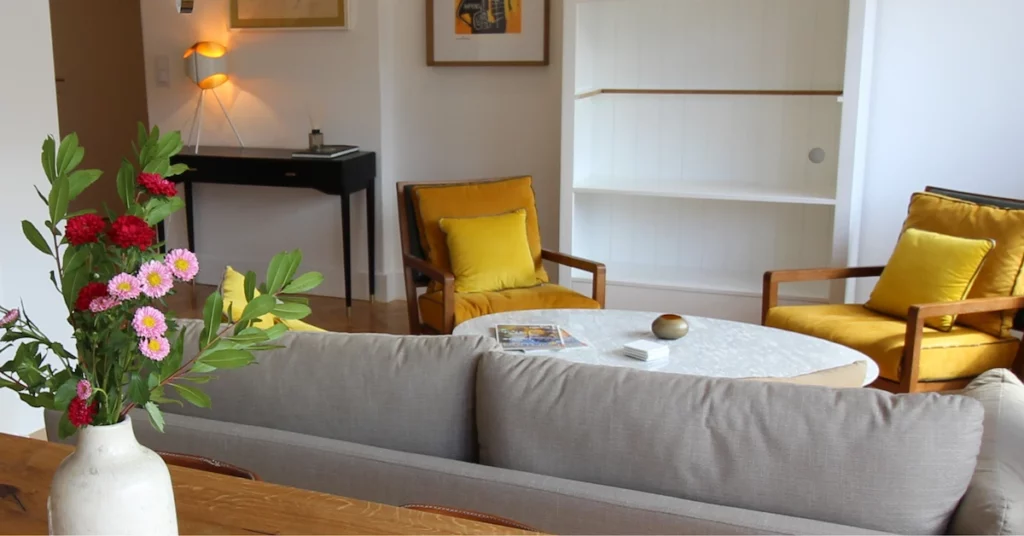
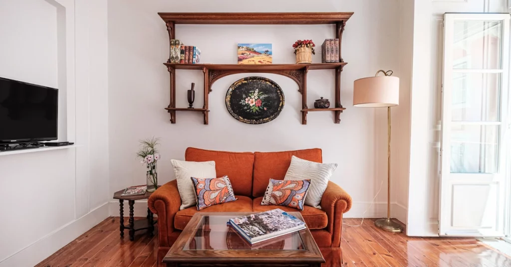
A balanced palette usually begins with neutral tones. This base creates visual stability and allows you to integrate other colors without compromising the harmony of the space.
2. Choose One or Two Accent Colors
Accent colors should be used intentionally and on specific elements—furniture, decorative pieces, or architectural details. Fewer colors, better readability of the space.
3. Use Color as a Guiding Principle
The repetition of shades or materials in different parts of the room creates unity, even when there are distinct styles. Natural wood is a frequent example of a connecting element.
4. Prioritize Textures Instead of Excessive Patterns
The diversity of materials adds depth without overwhelming the environment. Mixing textures is more effective than accumulating excessive prints or visual contrasts.
5. Consider Natural Light and Architecture
The same color can have very different interpretations depending on sun exposure, ceiling height, or existing finishes. The palette should always be tested in the real context of the space.
At Space Creation, the choice of color palette is part of an overall design strategy. Each decision is made based on the space, its use, and its intended longevity, ensuring coherence and functionality over time.
The result is balanced environments, clear in their interpretation and prepared to evolve without losing their identity.
If you are planning to renovate or create a new space, this is one of the key points to ensure a solid project from the start.
Talk to us. We can help harmonize your space.